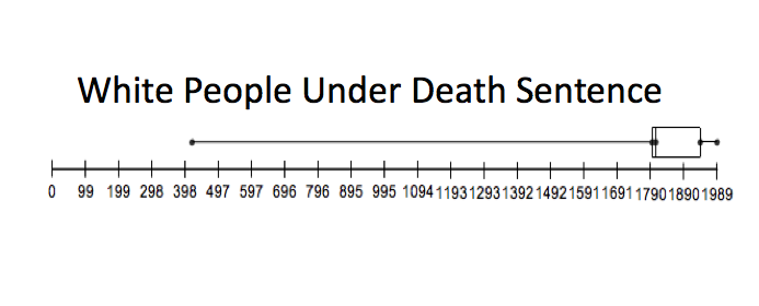
This data set shows the number of White People under Death Sentencing from the years of 1980-2009.
Five Number Summary: 418, 1787.5, 1806, 1910.5, 1989. Outliers: 418 and 1368
Five Number Summary: 418, 1787.5, 1806, 1910.5, 1989. Outliers: 418 and 1368
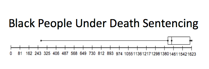
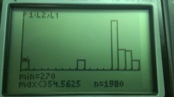
This data set (pulled from the same set as the above box plot) shows the number of African Americans under Death Sentencing from the years of 1980-2009.
Five Number Summary: 270, 1401, 1435, 1552, 1812. Outliers: 270 and 978.
Five Number Summary: 270, 1401, 1435, 1552, 1812. Outliers: 270 and 978.
This image shows something that was contrary to our popular belief: on avergae, there actually more white males on death row than that of black males.
Direct Comparison of Two Box Plots

What we see when we compare these two graphs of quantitative data is that the median for white people under death sentencing is actually much greater than the median for black people under death sentencing; additionally, both groups people had sentencing outliers on the lower end of the spectrum. The results shown in these two data sets were surprising due to the fact that we actually expected black people to have a higher median than white people; we were counting on factors such as racism and gang activity to sway death sentence decision making. Evidently, it did not play as a big of a role as one may have expected.
The couple hundred difference in the minimum in the five number summary first reveals the fact that black people have a much less death sentencing frequency than white people do; when the maximum value amounts are looked at the difference between the two yet again reiterate the undeniable fact that over the years of 1980-2009, white people had a much higher frequency in death sentencing than black people did. The median reveals the middle number of the number sets and also reveals on average, how many people were sentenced to death per year. The median for black people was 1435 people whereas the median for white people was 1806; that is a big difference in median for both races!
In addition to the fact these data sets reveal huge differences between the five number summaries, we also must look at the outliers for both of the data sets. Black and white people who had faced sentencing both had two outliers, both were below the spectrum. Because sentencing is subject to human biases and cannot remain completely consistent throughout the years, it is expected that there would be some outliers below the spectrum. Overall, these box plots reveal that white people faced harsher sentencing consistently throughout the years than black people did. The data reveals that contrary to our previous predictions, being white actually affects one's sentencing in a harsher manner compared to that of blacks.
White People Facing Death Sentencing
Shape: skewed right, and uni modal with one peak. There were outliers below the spectrum and they were: 418 and 1368. Mean is 2001.5 and median is 2003.5. Range is 1571.
Black People Facing Death Sentencing
Shape: skewed right and uni modal with one peak. Outliers on lower end and they include: 270 and 978. Mean was 2001.25 and median was 2003.5. Range was 29.
Direct Comparison of Histograms
What we see when we compare the histograms is that overall, both graphs are skewed left, this means that there are outliers below the median and therefore drag the mean down. These graphs do seem similar , but there are some differences that reveal some information about our data sets. Firstly, The taller histogram shows that overall frequency wise, white people had more death sentences than when compared with black people. This means that not only on one occasion, but consistently throughout the years white people faced harsher sentencing when tried by the jury.
Additionally, these graphs do seem to peak at the same time around the same year, and overall, it is the graphs themselves are very similar to one another with the exception of white people having a higher frequency.
Additionally, these graphs do seem to peak at the same time around the same year, and overall, it is the graphs themselves are very similar to one another with the exception of white people having a higher frequency.
Source: Statistical Abstract of the United States, 2012. Washington, D.C.: U.S. Census Bureau, 2011. Print.http://bossip.files.wordpress.com/2013/03/prison.png%3Fw%3D620
