Chapter Three: Year, Poverty, and Death Row
In this part of our project, we are looking at the correlation between the number of African American families living below the poverty line and the number of African Americans sentenced to death row, through the years of 1980- 2009. Before we began to collect the data, we hypothesized that given the fact most people in prison are those who are either in low-income housing or live below the poverty line, the percentage of prisoners who were financially poor would be high. This could result for a multitude of reasons; two prominent ones would include the fact that poorer people cannot afford to hire lawyers who can effectively argue and represent them in their court hearings and that poorer people may be more likely to engage in criminal activity, given their circumstances. Taking this knowledge, and combining it with the fact that 40.7% of the prison population consists of African Americans, who only make up 13.7% of the U.S population, we arrived at the conclusion that most Africans on death row would be below the poverty line. The scatter-plots below shows that correlation, with the y-axis being the number of death row inmates (numbers accurate) and the x-axis is the number of families below the poverty line (in thousands) The y axis is our response variable, our x-axis is our explanatory variable.
Data can be found by clicking here.
Data can be found by clicking here.

We found that for the most part, our data followed the regression line with a couple of exceptions below the regression line. As seen in the scatter plot graph here, the points mostly follow the same pattern as the regression line.
In our residual plots, we can also see that the data plots fall very close to that of the plot line with the exception of the two clear outliers below. These outliers can also be seen clearly on the scatterplot graph above, it makes sense that their residual value would be larger due to extrapolation.

Our least-squared regression equation is as follows: y=2917.4897+-.6375(x)

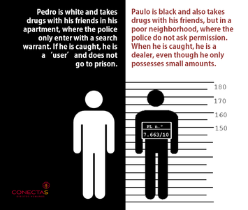
This image shows that perhaps the reason more white people are on death row than black people who are below the poverty line may be because the ratio of white to black for lesser sentencing will be higher.
Conclusion
Our data suggests that contrary to our original hypothesis, less families below the poverty line faced death sentencing . There was a negative correlation between these two factors; for reasons we don't quite know. We believe that our original hypothesis, that those on death row will have come from lower incomes, may be based on flawed assumptions of the data. To further investigate, we should look to see what percentage of the African American prison population is due to other crimes. Perhaps Poverty and those crimes are linked more closely than death sentencing and race.
Source: Statistical Abstract of the United States, 2012. Washington, D.C.: U.S. Census Bureau, 2011. Print.http://www.conectas.org/arquivos-site/PL%20Drogas%20EN.png
