
Caucasian People Under Death Sentence Density Curve
This Density Curve graph is not a normal density graph in that it is not bell-shaped; in fact it is skewed to the left. The reason this curve graph isn't normal is because sentencing for Caucasian prisoners has not been symmetrical throughout the years; it did not peak during one year and then mirror past sentences afterward. Instead, sentencing throughout the year has not followed a pattern and been unevenly distributed throughout time; this would explain the skewness of the graph.
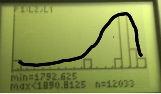
Mean: 1700.75
Standard Deviation: 434. 01
About 1701 Caucasian people facing death sentencing shows us the point between which all the other values are evenly split in half. In other words, one half of the graph shows the lower, or minimum, amount of males facing death sentencing and the other half is just the opposite. About 434 people are the amount that deviate away from the mean.
5 number summary and corresponding z scores: 418, 1787.5, 1806, 1910.5, 1989
Min: 418, -2.96
Q1: 1787.5, .2
Median: 1806, .24
Q3: 1910.5, .48
Max: 1989, .66
The z scores tells us how many standard deviations a point is away from the mean, and can tell us if the data is skewed with the mean and median don't match up. In this case, It tells us that our data is skewed, because the median's z-score is .24. The median's z score is .24 since it is .24 points away from the mean, since it is skewed. If this were a normal curve, the mean would equal the median but because our graph is skewed, the median and mean values are different.
The point we choose in this data set is falls in-between the median and the third quartile, in the 58th percentile. This means 58 percent of the years in the set had less Caucasian prisoners under the death sentence.
African Americans Under Death Sentencing Density Curve
This Density Curve is similar to that of the one above; it is also not normal and is skewed left as well. For all of the same reasons listed above, this would not be a normal density curve graph because African Americans who faced death sentencing also did not follow a pattern throughout time. Sentencing was unevenly distributed and is the reason for why this graph is skewed.
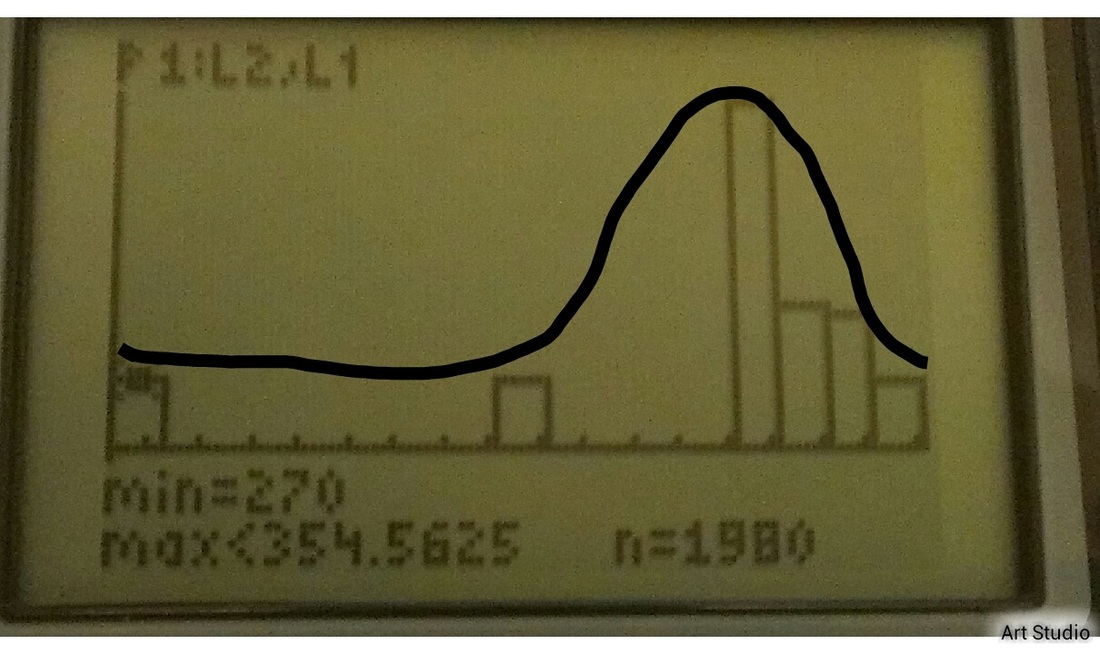
Mean: 1344.83
Standard Deviation: 378.84
In this case, the mean value reveals to us at which point that the amount of death sentenced prisoners are equally divided in half. The standard deviation shows that about 378.84 amount of people deviate from the value given the mean. Again the median is not equal to that of the mean because our graph is skewed and not a normal curve.
5 number summary and corresponding z scores:
min: 270, -2.84
Q1: 1401 .15
Median: 143, .24
Q3: 1552, .55
Max:1812, 1.23
Same pattern as first set of data.
The point in this data that occurred in the same year the data point used in the last set for percentile calculation was also in the 58th percentile. In this case, it means that 58 percent of the years within the data set had less African American prisoners under the death sentence.
Source: http://news.stanford.edu/news/2012/may/images/race.jpg
